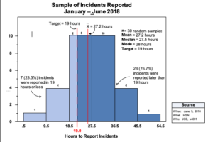
Have you ever wondered what else a line graph could tell you besides a trend? You can see some of the data points are higher than others, and there are also extremes in the data, but what else could you observe? A Histogram aggregates all the data points from the Line Graph and interprets it for you. It can open the door to efficient problem-solving.
What is a Histogram?
A Histogram is a chart plotting a variable, like time, against the number of occurrences in the variable category. For example, how many clients were served between 4:00 and 5:00 p.m.? How many cases were closed between 20 and 25 days? It can provide information on the degree of variation of the data and show the distribution pattern of the data by bar graphing the number of units in each class or category. A histogram takes continuous (measured) data like temperature, time, and weight, for example, and displays its distribution. The picture a histogram provides about the distribution of your process outcomes can help you determine what or where the problem might be. Dispersion of the data can produce a wide variety of histogram shapes, each telling its own story.
When to Use a Histogram
Following are some practical applications for Histograms:
- Set goals or targets.Once the histogram is constructed, you may choose to reduce the mean and extreme variation in the process, returning the process to comply with current or new requirements.
- Show process capability.If the customer’s requirements are available, they can be plotted on the histogram to show how much the product, service, or test scores are not meeting requirements.
- Stratify data. When factors stratify the data thought to be causing variation (what, when, where, and who) the major causes of the difference become more detectable.
- Confirm results.By comparing histograms before and after countermeasures have been implemented, a shift in the data distribution can indicate effectiveness in attacking the root causes of the problem.
- Compare results.By comparing productivity rates of two operators using the same machine on different shifts, or two physicians with different patient discharge rates, or equipment reliability of two different maintenance crews, histograms can give us the insight we need to identify the significant problem.
The Histogram is often called the “Unsung Hero of Problem-solving” because it is underutilized. For example, if you were trying to solve a staff retention problem, you might generally stratify terminations by job classification and determine that 30% of the people who left last year were technicians. However, if we first applied a Histogram to the same population of terminated employees, except this time by how long they were employed before termination, the histogram might reveal that 70% of the people quit in less than six months, and half of them were nurses, although overall nurse turnover was only 25% for the year. The Histogram pointed us to when in the retention process, they were leaving, which, in this case, might turn our focus towards hiring, on-boarding, and mentoring instead of compensation or recognition practices, for example.
When stratifying continuous data, consider the Histogram before constructing a Pareto chart and deciding on the problem. You may be surprised.
