The Fallacy of Measuring Performance by Using Averages
It may not make sense at first, but customers can be very dissatisfied even when your performance is exceeding their critical requirements. You’ve done your homework, conducted focus groups, analyzed customer feedback and even analyzed research data. You’ve concluded that customers will be very satisfied if served within 30 minutes. Over the past twelve months your performance has averaged 25 minutes, yet the complaint rate is through the roof. How can this be when you’re consistently beating the target by 5 minutes?
The Invisible Problem
Let’s talk about averages, and tracking performance using metrics stated as averages, such as Average Wait Time, Average Time to Answer, and Average Time to Treat a Stroke Patient. In all cases, you can be beating the target and still be failing half of your customers or patients. Why? Because with an average, about half the data is above the average and half is below – that’s what an average is. This can be seen on a line graph or control chart; however, the histogram will reveal just how bad the problem is and which customers are affected. This is key for effective Pareto analysis, identifying the significant problem and eventually confirming root causes. Let’s review an example.
The line graph below revealed a trend for the past 12 months of monthly averages between 23 and 27 minutes per month. A random sample of 100 customers during that period showed an average of 25 minutes.
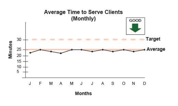
The performance measure indicates that average performance is better than the target, and that maybe, there is really nothing to be concerned about. Nevertheless, the team decided to dig a little deeper into the data.
A histogram was created using the sample data and revealed what was really happening.
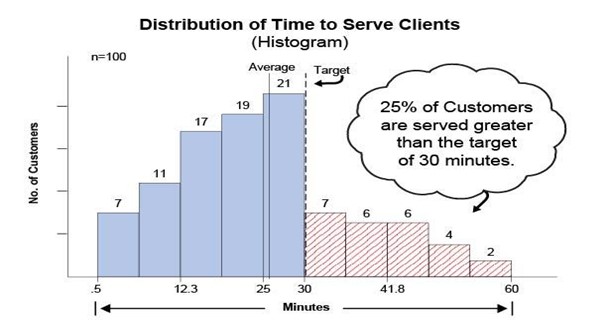
The histogram showed that 25% of the customers were served in more than the 30 minute target, yet the average time to serve was 5 minutes below the target. Conclusion: A measure stated as an average hides the inherent variation within the data. You don’t see it with a line graph tracking weekly, monthly or annual averages, but the customer is feeling it.
A Better Measure
A more customer-centric measure which would reveal true performance in meeting customer requirements is to track the “Percentage of Clients/Customers/Patients Served within the Target”, or in the above example, 30 minutes.
The following chart shows a more customer-centric measure:
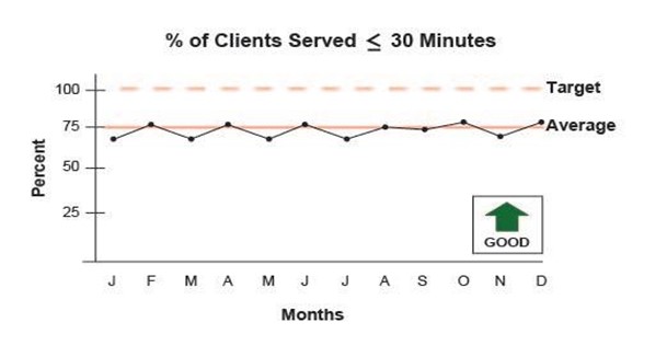
This is a diagnostic measure which immediately shows the degree to which customer requirements are being met. As you might expect, the closer the actual average and the target are, the greater the percentage of customers exceeding the target will be. That’s the nature of, and the problem with averages.
Summary
Performance tracked with averages are descriptive and do not lend themselves to analysis. Measures stated as the degree to which requirements are met are diagnostic and do facilitate analysis. The key to customer satisfaction is to measure your performance with a customer-centric measure and target. But what if the measure is appropriate and the target is not? This will be the subject of the next article.