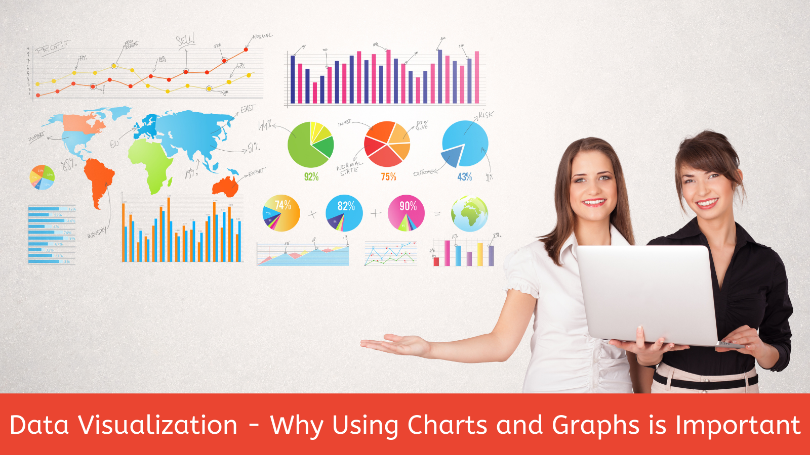
Why Are Charts Useful for Visualizing Data?
Last year, one of my Yellow Belt students asked why he should use a Pareto chart to identify an item of significance when he could slice and dice the data with a spreadsheet and reach the same conclusion. I responded something like “And how would you easily identify a pattern in the data, or communicate your findings with an audience that didn’t understand the topic as well as you?” Tables of numbers are difficult to assimilate by the human mind. Adults like to see pictures and charts much more than they do columns and rows of numbers, which you tell them are significant. The best analyst in the world won’t be effective if he/she can’t communicate quickly and convincingly with facts. Charts and graphs can help us do that. Personally, I would rather look at a screen shot of a Pareto chart or a histogram than a spreadsheet.
Another important feature of charts and graphs is that they show the “shape” or patterns of the data. To the curious and analytical mind, data patterns are key for identifying problems, priorities, root causes and effective solutions.
Which Charts Are Most Useful?
Basically, charts fall into three major groups based on the objective of the analyst and story-teller:
- To Show Trends
- To Compare Values
- To Explain Stratification for Prioritization
Let’s briefly review the primary types in each group.
Trends are most frequently shown with a Line Graph, but a bar chart is also used when there are only a few data points, such as a data point for each of three consecutive years. Line graphs can be used for both discrete and continuous data. I like to use a Line graph at the beginning of an improvement initiative to show factually how long an issue has persisted, whether it’s getting better or worse, and the gap between the actual and target. Patterns easily seen in Line Graphs include dips in the trend, several data points in a row either going up or down, several data points in a row falling below the mean of the data set, or periodicity in the data.
Comparing values is most often done with a Bar Chart, or Radar Chart, because the values being compared are not summative or part of the same whole. For example-productivity rates of two shifts, population of three cities, or defect rates from five different suppliers. Pie Charts can be used for comparisons of elements which compose a whole, like the budget breakdown of a department, or proportion of employees by position classification. Highs and lows can be seen easily with these charts leading the curious person to wonder why and explore further through stratification.
Data is stratified so that problems can be prioritized. Box Plots, Histograms and Pareto Charts are three charts that have no equals in this area. Applying a Histogram to a continuous data set enables us to see the magnitude of a promising area for analysis. For example, if employee retention was your concern, where would you focus your attention for solutions? By applying a Histogram to the departed employees by their lengths of service, we might see that 50% of all new hires leave within the first 12 months on the job. This might direct our root cause analysis to the hiring, onboarding, and probationary period of the new hire, rather than later in the retention process. When applying the Pareto Chart, we are trying to understand the composition of the whole. For example, If we determined that 50% of the new hires left within 12 months, the Pareto Chart could tell us which department, position, or another feature was the most prevalent. By solving the most significant problem, we’ll have the greatest impact on our organization. Understanding the relationships of one chart to another can facilitate problem solving, as well. For example, looking at a data set using a Line Graph, Histogram and Box Plots can reveal information not apparent to the “non-chart” person. And applying a Line Graph, Histogram, and Pareto Chart in a series to continuous data can lead to a conclusion not considered by the average person.
Summary
When you graph data, you are not only beginning to understand it, but developing a feel for it. And if you can develop a thorough understanding of the data, you’ll be able to explain it to others more effectively. Remember, the best problem solvers are able to develop effective solutions, and sell them to the decision-makers.